You spend two days on a newsletter. The logo looks sharp, the button is bright blue, the grey text is easy on the eyes. Then a colleague opens it on her phone at night and asks, "Where is your logo?"
It is still there. It is just black on a black background.
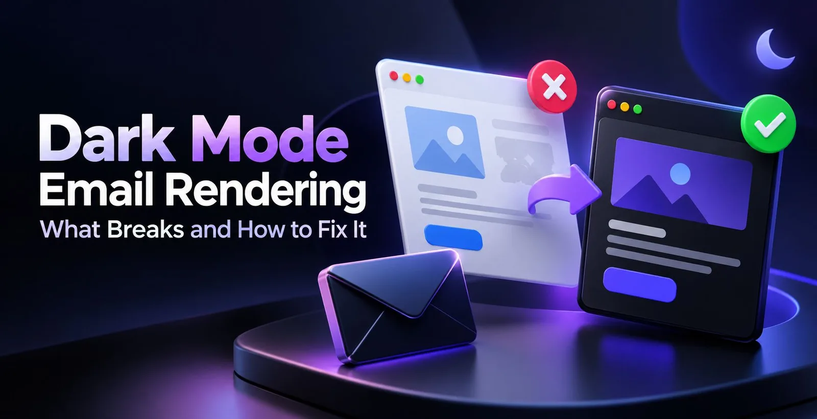
This is the dark mode email problem and it happens to small shops and big brands alike. Here we will go through what dark mode does, to your email, what breaks and how to fix it without needing a developer on call.
First, what do we mean by dark mode and rendering?
Dark mode is a phone or app setting that shows a dark background with light text. Many people switch it on because it feels easier on the eyes at night, or because it saves a little battery on some screens. Almost every popular email app has it now.
Rendering simply means how your email is drawn on someone's screen. The same email can look different in Gmail, Outlook, Apple Mail or a Samsung phone's mail app, because each one reads your code in its own way.
So this post is about one thing: what happens to your email's look when the app, not you, decides to change the colours.
What email apps do in dark mode
Apps behave in roughly three ways.
Nothing changes. Your light email stays light, even if the rest of the app is dark. Nothing breaks, but it can feel like a bright flash on a dark screen.
Partial change. The app flips only the very light or very dark colours. A white background turns dark grey and black text turns light, while a red button usually stays red. Gmail's mobile apps are known for this.
Full change. The app inverts almost everything, including colours you chose on purpose. Some versions of Outlook do this, and a cream background can turn muddy brown.
The catch is that this differs by app, phone, operating system and even app version. Something that looked fine in March can look odd after an update in June. Treat any "this app does X" rule, including the ones here, as a starting point and check it yourself.
What usually breaks
Logos and icons vanish. A transparent PNG logo with dark lettering looks great on white and almost disappears on a dark background. Plain black social icons suffer the same fate.
Text inside images stays put. If your offer is written inside a banner image, the app cannot recolour it. You may end up with a bright white banner sitting like a sticker in a dark email.
Buttons lose their punch. A light button with dark text can get flipped until the label and the button are almost the same shade. Image-only buttons have the same trouble as any image.
Pure white and pure black get swapped. Many apps look specifically for #FFFFFF and #000000. If you used those exact values, you are the most likely to be affected.
Borders, backgrounds and links act strangely. Thin light-grey borders can vanish, background images can get dimmed, and link colours may change to a lighter blue that clashes with your brand.
How to fix it, starting with the easy things
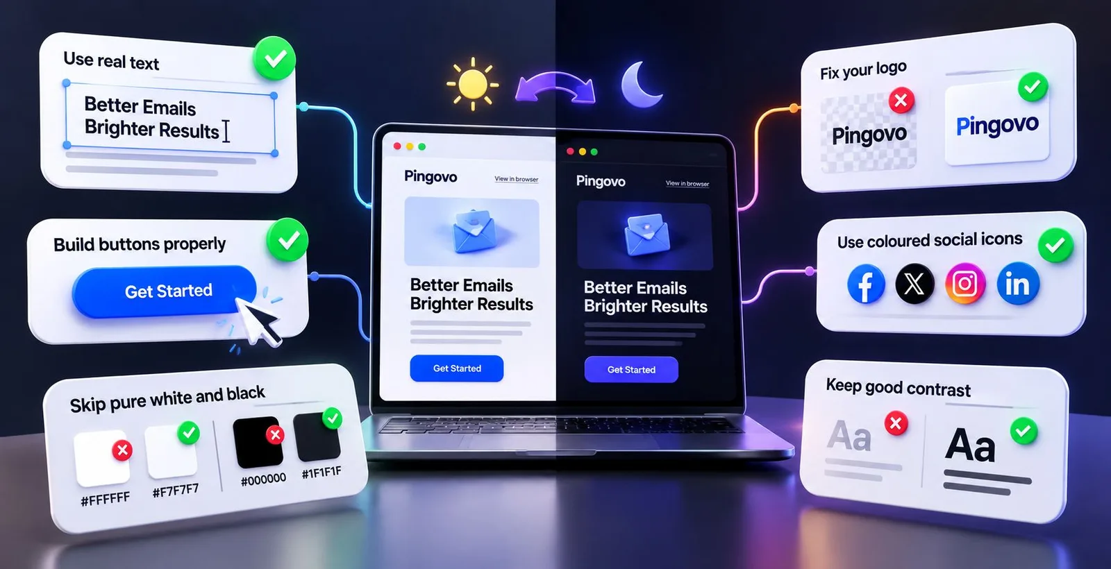
You do not need advanced code for the first round. These steps solve most problems.
Use real text, not pictures of text
Write headlines, offers and button labels as normal text. Text can change colour with the background, a picture of text cannot. It also helps people using screen readers, and your message stays visible when images are blocked.
Fix your logo
There are two simple ways. Add a thin white or light-grey outline, or a soft glow, around the dark lettering of a transparent PNG. On a light background you barely notice it, and on a dark one it keeps the shape visible. Or place the logo on a small solid box in your brand colour, so it looks the same everywhere.
For social icons, choose coloured ones, or ones inside a coloured circle, instead of plain black.
Skip pure white and pure black
Try #F7F7F7 instead of #FFFFFF, and #1F1F1F instead of #000000. It is a small change that often stops apps from treating those colours as "swap me" signals, and it looks softer on the eyes.
Build buttons properly
A button should be real HTML with a background colour and a border in the same colour, not an image. Pick a mid-tone shade, like a strong blue or green, that works on both white and dark backgrounds.
Keep good contrast
Contrast is the difference between text colour and background colour. Light grey text on white is already weak, and dark mode can make it worse. Aim for text that stays readable even if the colours flip.
The advanced part: telling the app what you want
Once the basics are done, you can give apps instructions. Only some of them listen, so this is an improvement, not a guarantee.
Say that your email supports both modes
Add these lines inside the <head> of your HTML. They tell apps like Apple Mail that you have thought about dark mode, so they should not blindly change things.
<meta name="color-scheme" c"light dark">
<meta name="supported-color-schemes" c"light dark">
Write dark mode CSS
A media query called prefers-color-scheme asks, "Is this person using dark mode?" and applies your own colours if yes.
<style>
  :root { color-scheme: light dark; }

  @media (prefers-color-scheme: dark) {
    .email-bg   { background-color: #121212 !important; }
    .main-text  { color: #EDEDED !important; }
    .logo-light { display: none !important; }
    .logo-dark  { display: block !important; }
  }
</style>
The last two lines show a handy trick: place two logos in the email and show only the right one. Keep the dark logo hidden by default, so apps that ignore this CSS still show the light version.
Gmail's apps generally do not follow prefers-color-scheme, and may strip some styles, so never depend on this alone. That is why the basic fixes come first.
Outlook.com needs its own selectors
Outlook.com on the web adds special attributes you can target. ogsc is for text colour and ogsb for background.
[data-ogsc] .main-text { color: #EDEDED !important; }
[data-ogsb] .email-bg  { background-color: #121212 !important; }
Keep overrides few, since too many can create new problems. And if you use a background image, always add a matching background colour behind it, so text stays readable when the image fails or gets dimmed.
How to test before you hit send
Dark mode bugs are easy to miss because we usually design in light mode.
- Switch your own phone to dark theme and send the email to yourself.
- Open it in more than one app. Gmail, Outlook and your phone's default mail app are a good start.
- Check the logo, buttons, footer links and any image with text.
- Check once with images turned off, since some people block them to save data.
- Fix, resend and look again. One round is rarely enough.
In Pingovo, you can build the email in the drag and drop builder or the custom HTML editor, use campaign preview, and send a test to your own inboxes before the real send. The blocks are mobile-ready by default, and you can add dark mode CSS in code view later.
Does dark mode affect inbox placement?
Not directly. Gmail or Outlook will not send your email to spam because a logo looked bad in dark mode.
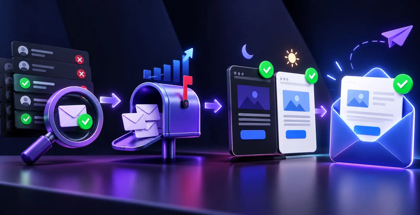
But it changes what happens after delivery. If the email is hard to read, people close it, skip the button or tap "report spam" out of annoyance, and those signals hurt your sender reputation over time. A good-looking email is the last link in a chain:
- Keep your list clean. Email verification removes invalid and risky addresses before they cause bounces.
- Warm up new mailboxes slowly. Email warmup builds trust with inbox providers before you send at full volume.
- Make the design work in every mode, as covered above.
Quick checklist
- Logo has a light edge or sits on a solid box
- Headlines and offers are real text
- No pure
#FFFFFFor#000000 - Buttons coded with background colour and border
- Background images have a fallback colour
color-schememeta tags added, plus dark mode CSS if needed- Tested in at least three apps, in light and dark theme
Frequently asked questions
What is dark mode email rendering?
It is how an email app displays your email when the user has dark theme on. The app may change background and text colours automatically, which can affect your design.
Why does my email logo disappear in dark mode?
Usually it is a transparent PNG with dark lettering, which blends into a dark background. A light outline or a solid colour box behind the logo fixes it.
Does Gmail support dark mode CSS for emails?
Gmail's mobile apps change colours on their own and generally ignore the prefers-color-scheme query. So safe colours, edged logos and real text matter more than custom CSS there.
Do I need a separate dark version of every email?
No. One well-built email that holds up in both modes is enough for most senders. A second logo or a few CSS overrides is usually the only extra work.
How can I check my email in dark mode before sending?
Turn on dark theme on your phone, send a test to yourself and open it in different apps. With Pingovo you can preview the campaign and send a test before it goes to your list.
Final thoughts
Dark mode is here to stay, and more of your readers will use it every year. You do not need to design twice. Start with real text, a logo that survives both backgrounds, softer colours and well-built buttons, then add code if you need it and test on a real phone.
Ready to verify, warm up and send your next campaign from one place? Create a free Pingovo account and start with 500 free verification credits, no credit card needed.